The Challenge
Matt wanted a science publication covering nine fields at once: paleontology, history, archaeology, Egyptology, general science, physics, environmental energy, genetics and medicine, and artificial intelligence. That is an unusually wide brief, and width is the thing that usually kills a publication like this.
A site with nine verticals has nine audiences that barely overlap. Someone reading about dinosaur tracks is not the same person reading about grid battery storage. Publish everything into one chronological feed and each reader sees mostly things they did not come for, then leaves. Split them too hard and the site is nine thin blogs sharing a logo.
Covering nine fields daily also means volume no individual writer can produce, in subjects that each need their own sourcing.
What We Built
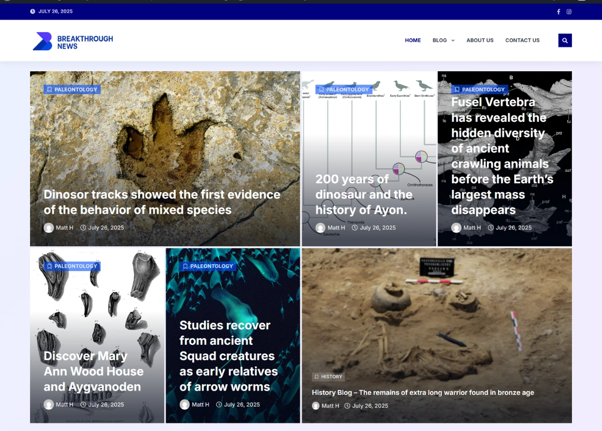
The home page gives every vertical its own block rather than mixing them into a single stream. Nine panels in a grid, each carrying that field’s four most recent stories with its own See All link into the archive. A reader scanning the page finds their subject in a few seconds and enters through it, and the other eight are visible without being in the way.
That structure is what lets a nine-vertical site work. Each block behaves like a small front page for its own subject, so archaeology readers and AI readers both feel like they landed somewhere built for them, while the site still reads as one publication rather than nine.
A sidebar of nine image tiles runs alongside the latest news column, repeating the same navigation in a second place. On a site this broad, one route into a category is not enough. Different readers scan a page differently, and the sidebar catches the ones who never reach the grid.
Editor’s Pick sits between the news feed and the category grid, on a full-width purple band that breaks the page in two. Four stories chosen across fields rather than within one. Its position solves a specific problem: it is the one place a reader is shown something outside the subject they arrived for, at the exact point they have finished what they came to read. That is where a single-subject visitor becomes a returning one.
Content publishing runs on an automated pipeline, with articles sourced, written and routed into the right vertical without anyone opening the editor. Nine subjects at daily frequency is not a workload one person can carry manually, and the category structure was designed so the routing has somewhere obvious to send everything.
The design runs deep blue and violet with white cards, which keeps a heavy home page readable. A site holding nine sections, a news grid, a featured band and a sidebar needs visual separation more than it needs decoration, and the colour blocks do that work by marking where one part of the page ends and the next begins.
Built to Scale Sideways
Adding a tenth field is a category, a block and a sidebar tile. Nothing underneath it changes, and no existing section shrinks to make room.
That was the point of the structure. A publication covering this much ground grows by adding subjects rather than by adding posts to the ones it has, and the site had to be able to take that without being rebuilt each time.