The Challenge
Noshad runs a creative studio doing character animation, product animation, motion graphics, logo design, video editing and commercial composites. Six services, six different buyers, and none of them buying a thing they can hold.
Creative agencies have a harder selling problem than most businesses. A restaurant shows food, a store shows products, but a studio is asking someone to pay for work that does not exist yet. The buyer is really deciding whether this team can be trusted with a launch video and a deadline. Every part of the site had to answer that question rather than describe the services.
There was a second problem underneath it. Studios in this space almost all hide their pricing behind a contact form, which means every enquiry starts with a quote negotiation and a large share of them were never going to afford the work anyway. That burns the studio’s time on people who leave.
What We Built
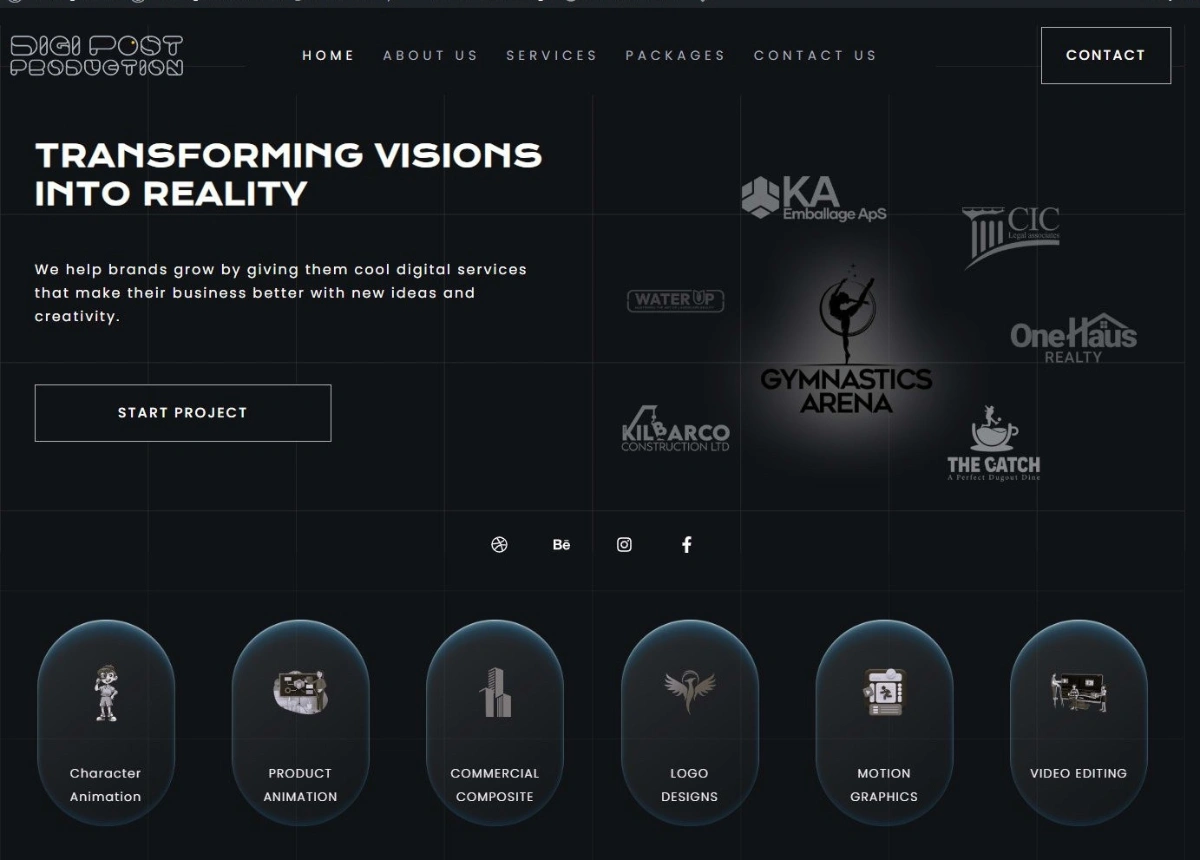
Client logos sit in the hero, beside the headline rather than buried in a strip near the footer. KA Emballage, CIC Legal Associates, One Haus Realty, Kilbarco Construction, Gymnastics Arena, The Catch. A visitor sees who already trusted the studio before reading a single claim about it, and the mix does its own work: packaging, legal, real estate, construction, sport, hospitality. Whoever lands here finds an industry close enough to their own.
The six services are separate entry points, each with its own icon and its own card, because nobody searches for creative services. They search for logo design, or product animation, or someone to edit video. Splitting them lets each service be found and sold on its own terms instead of hiding inside a general offering.
Packages got their own page in the main navigation. Publishing prices costs some enquiries and that is the point. The people who arrive at the contact form have already accepted the range, so the conversation starts at scope rather than at whether the studio is affordable, and the tyre-kickers filter themselves out before they cost anyone an hour.
Behance and Dribbble sit first in the social row, ahead of Instagram and Facebook. Creative buyers check those two before they check anything else, and a studio with a live presence there passes a test that no amount of copy on a homepage can.
The rest of the page runs on proof and capture. A numbers band covering projects, clients, reviews and contracts. A portfolio section carrying the actual work. A booking path and a newsletter block, so an enquiry that is not ready today has somewhere to go other than away.
The Design
Dark, almost black, with a faint grid and soft rim lighting on every card. That choice was driven by the work rather than by taste. Animation and motion graphics are bright, saturated and colourful, and a white site flattens them. On a near-black background a reel thumbnail glows, which is the same reason editing suites and video platforms are dark.
The cards use tall rounded shapes instead of the usual rectangles, which reads closer to a studio than to a template, and the glow on their edges gives the page depth without needing a single decorative image. The design gets out of the way and lets the work be the brightest thing on the screen, which is exactly the right order for a studio.