The Challenge
Nares was building an Amazon affiliate store for the Spanish market in home and garden, and the obvious version of that site is the wrong one. Most affiliate stores in this category run four hundred products and win nothing, because a visitor who wanted four hundred options was already on Amazon and never needed the middle step.
Home and garden buyers behave differently to electronics buyers too. Nobody comparison shops a plant pot on price. They are looking for something that fits a corner of a room they are already picturing, which means the site has to sell the room before it sells the product.
And it all had to work in Spanish, for Amazon España, in a market where most affiliate content is translated from English and reads that way.
What We Built
The catalogue was kept deliberately small. Eight products on the home page rather than a paginated grid, priced from €6.36 for a gift plant up to $90 for a balcony furniture set. Each one carries a photograph, a name, a price and a single Buy Now button. Nothing to filter, nothing to sort, no comparison table.
Cutting the catalogue is the whole strategy here. A store with a hundred garden items is a worse Amazon. A store with eight that someone chose is a recommendation, and a recommendation is the only thing an affiliate site can offer that the marketplace behind it cannot.
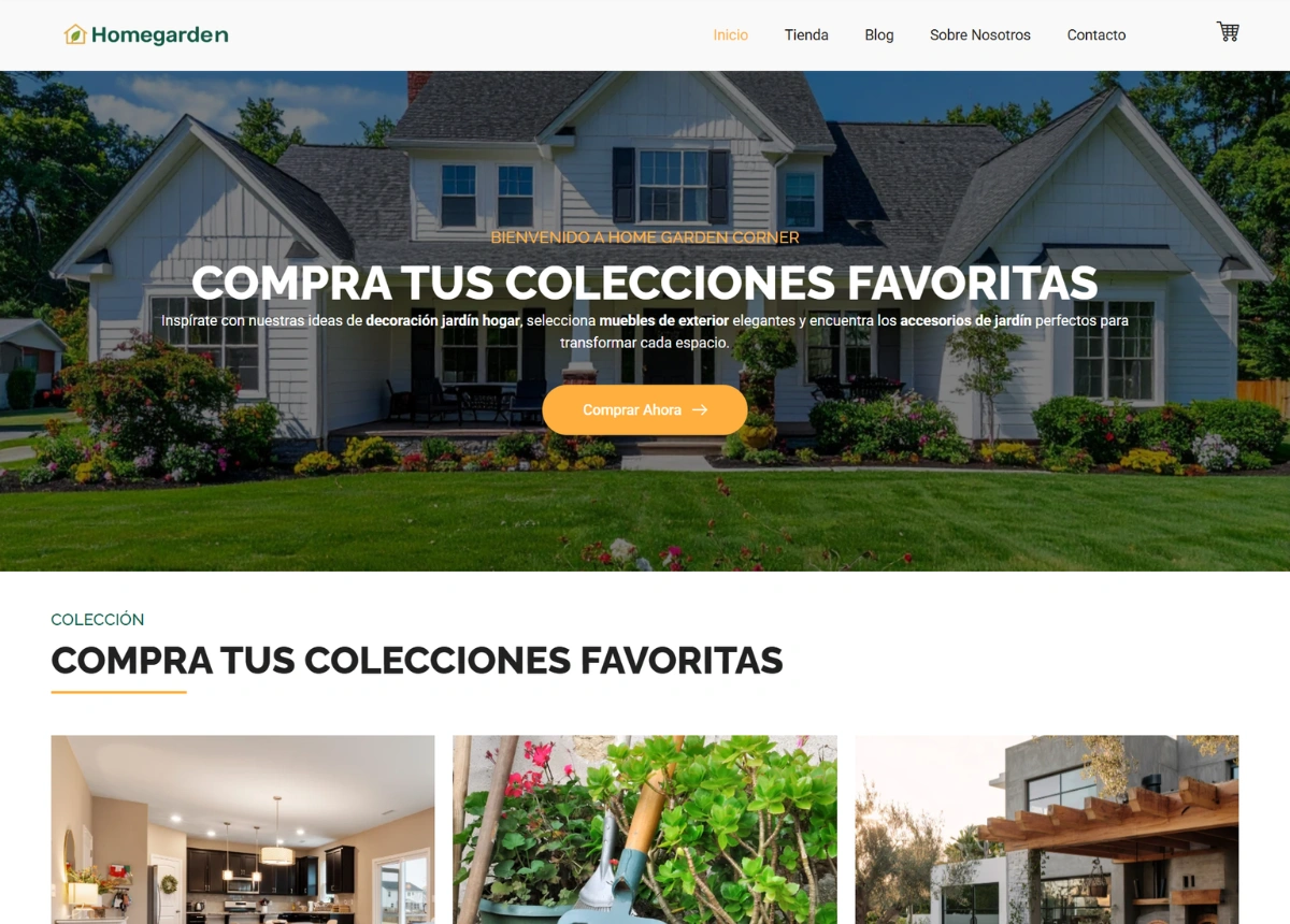
Three collections organise everything above the products: home decoration, garden tools, and outdoor living. That split follows how the buyer already thinks about the job, room by room and area by area, rather than following Amazon’s own category tree.
The site was written in Spanish for Spain rather than translated into it, and it points at Amazon España specifically. Spanish affiliate content in this niche is mostly machine-translated from English blogs, so writing natively is a low-cost advantage in a market where competitors are not bothering.
An inspiration gallery sits below the blog, running interiors and garden photography with no products attached and no prices. That section sells nothing directly and it belongs there anyway. In home and garden the visitor is browsing for ideas long before they are buying, and a site that only shows things for sale gives them no reason to stay long enough to want anything.
The blog covers storage ideas for small spaces, renovating a kitchen without spending a fortune, and decoration trends. Those are search terms people actually type in Spanish, and none of them mention a product. They bring in a reader at the idea stage, and the products are waiting when the idea turns into a purchase.
A newsletter block sits between the products and the blog, framed around ideas rather than deals, which is the register the rest of the site is already speaking in.
The Design
Deep green and cream with orange only on the buttons. Every action on the page is orange and nothing else is, so a visitor scanning for what to click finds it without reading. The green does the branding, the photography does the selling, and the interface stays out of both.
Products sit on plain white cards with wide spacing rather than in a dense grid. Eight items with room to breathe read as a selection. The same eight packed tightly would read as an incomplete shop.