The Challenge
Greek Boys sells gyros, souvlaki wraps and bowls in the UK, and the food is halal and vegan friendly. Two facts that decide whether a customer walks in or scrolls past, and two facts that most restaurant sites bury three clicks deep in an about page.
The bigger design problem was that the restaurant serves two different people. One is booking a table for Friday night. The other is ordering a lamb souvlaki wrap to their desk at 12:40pm. Build for one and you lose the other. Most restaurant templates pick a side, usually the booking, and treat delivery as an afterthought.
What We Built
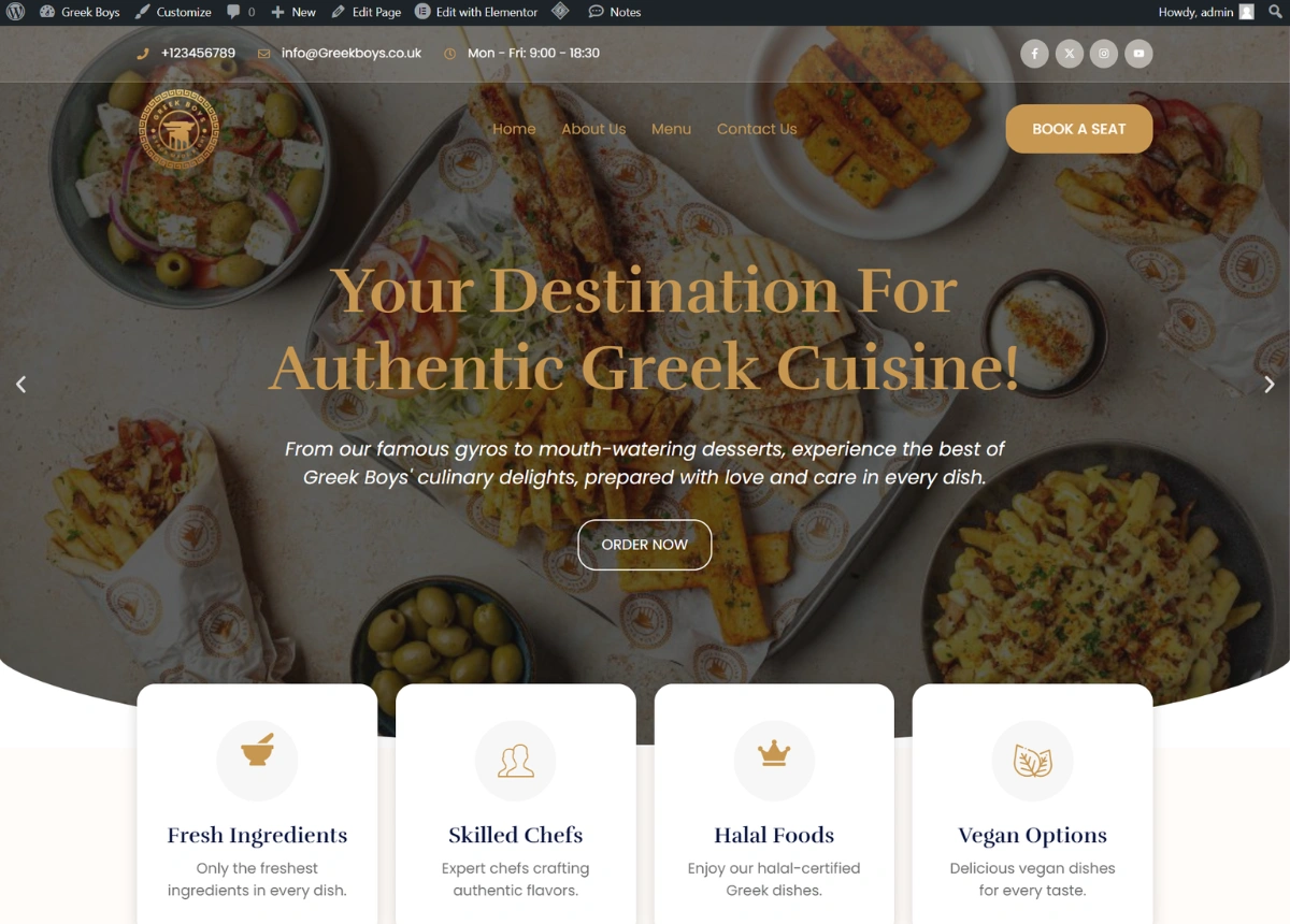
A WordPress and Elementor site that runs both paths in parallel from the first screen. Book a Seat sits in the header, Order Now sits in the hero, and neither one competes with the other for attention. Every section further down picks a side and commits: the menu blocks lead to ordering, the opening hours and festive package blocks lead to booking.
Halal and vegan went into a row of four cards directly under the hero, next to fresh ingredients and skilled chefs. A customer who needs to know gets the answer in the first two seconds without reading a paragraph, and nobody has to phone ahead to check.
The menu section shows real dishes with real prices rather than a link to a file. Titbit vegan gyros at £6.79, lamb souvlaki wrap at £10.95, chicken souvlaki bowl at £13.99, falafel bowl at £9.69, each with a short line describing what is actually in it. Below that, a Popular Main Course row repeats the three best sellers as ordering cards, because a returning customer wants the thing they had last time, not the full list again.
Opening hours got their own block instead of a footer line, and they split properly: Monday to Thursday from 8am, Friday to Sunday from 10am to 9pm. A weekday breakfast crowd and a weekend dinner crowd are not the same customers, and the block makes that obvious at a glance.
The rest is built for repeat business. A festive feast package section for seasonal promotions that can be swapped without touching the layout. A newsletter block for offers. A recipes gallery and blog area for search traffic. A partnership row for delivery platform and supplier logos.
The Design
Deep navy and gold, chosen against the food photography rather than for the brand alone. Greek food is beige and green on the plate, and it disappears on a light background. Navy blocks under the stats bar and the opening hours section give the photography something to sit against, and the gold picks up the grill colour in the dishes themselves.
Card layouts run through the whole page, so the client can add a dish, a review or a promotion without a section falling apart. That matters more than it sounds. A restaurant site that needs a developer every time the menu changes stops being updated by month three.