The Challenge
Health and beauty is a crowded affiliate category with a wide product range underneath it. A $4 skincare set and a $550 home gym are both health purchases, but the person buying them is in a completely different frame of mind, and a store that treats them the same converts neither.
The store also pulls from two different affiliate networks at once. Amazon supplies the physical products, from grooming kits to resistance bands, and ClickBank supplies digital programmes. Those are two separate catalogues with two separate formats, two commission structures and two kinds of buyer, and they had to sit inside one storefront without the site feeling like two websites stitched together.
What We Built
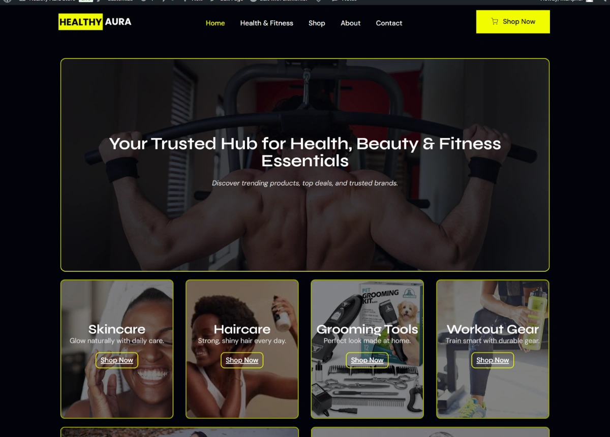
Six categories carry the structure: Skincare, Haircare, Grooming Tools, Workout Gear, Yoga Mats and Supplements. Each gets a photographic tile with its own line of copy and its own button, laid out in an asymmetric grid rather than an even row. The four smaller tiles take the everyday categories and the two wide ones take yoga mats and supplements, which is a layout decision doing merchandising work. A visitor’s eye lands on the wide tiles first, so the categories worth pushing get the attention without needing a banner to say so.
Price anchoring runs through the product grid. Nearly every card shows the original price struck through beside the current one with a discount badge, from a 40 percent cut on resistance bands to a home gym down from $650 to $550. In a category this saturated the buyer is not choosing a brand, they are checking whether the deal is real, and the grid answers that before the product name is read.
The dark theme was chosen against the products rather than for style. Skincare bottles, supplement tubs and gym equipment are photographed on white backgrounds by every manufacturer, and on a white site those images dissolve into the page. On near-black each product card reads as a separate object, and a single yellow accent marks every clickable thing on the site so nothing else competes for the click.
Trust was built in layers because an unknown affiliate store has none of its own. Testimonials carry names and roles matched to the audience, a college student, a gym owner and a personal trainer. A trust bar covers shipping, payment security, deals and support. The about section states plainly that products are selected from Amazon and ClickBank, which is the honest version of the pitch and a better one than pretending to be a retailer.
A newsletter offering 15 percent off sits above the footer, and the policy pages including affiliate disclosure sit in it. In a category where readers are already suspicious of recommendations, the disclosure is worth more visible than hidden.
Running the Store
Products, prices and discount badges are all managed in WooCommerce, so the catalogue can be reworked without any layout being rebuilt.
The category grid holds its shape whether a section has six products or sixty, which matters on an affiliate store where the range changes constantly as items go out of stock or drop out of the programme.