The Challenge
Mike’s Vegan Grill has been serving plant-based food since 2018, and the restaurant does not want to be a vegan restaurant in the narrow sense. The line the owner uses is that the menu became a favourite among vegans and non-vegans alike. That is the whole business, and it is a hard thing for a website to pull off.
Lean too far into the vegan label and you filter out the larger half of the market before they read the menu. Hide it and you lose the people actively searching for it. Most plant-based restaurant sites solve this by going pale and clinical, all leaf icons and beige, which makes the food look like a health penalty rather than a burger someone wants on a Friday.
What We Built
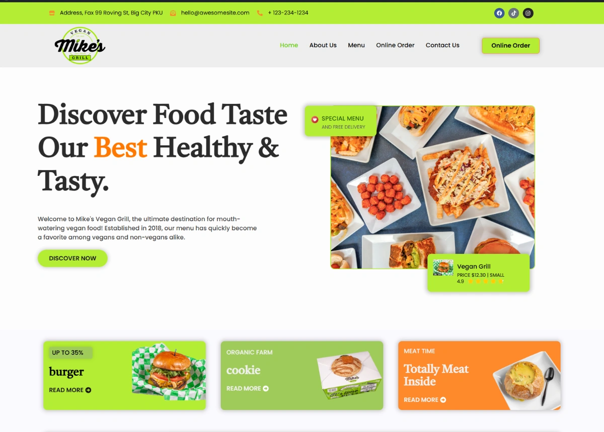
The design leads with the food and lets the word vegan arrive second. The hero is a plate shot, the headline talks about taste before it talks about diet, and the first thing under it is a promo strip for burgers, cookies and grilled mains. A meat eater scrolling past sees a burger. A vegan sees a vegan burger. Nobody gets sent away in the first three seconds.
Green and orange carry the palette instead of the usual white and sage. Orange does the selling, sitting on every price, every rating and every button, while green holds the sections together. It reads as a grill house that happens to be plant-based, which is exactly the order the restaurant wants those two facts in.
The menu grid is built like a delivery app rather than a printed menu. Photograph, dish name, price, star rating, all in one card. Shrimps tomato at $18.30, patty melt at $8.75, healthy oatmeal at $15.30. A customer scanning eight cards is comparing price and rating at speed, which is how people actually pick food online, and the layout lets the restaurant add or drop a dish without rebuilding a section.
Trust needed its own space, because a first-time customer is being asked to spend money on food they are unsure about. So there is a chef section with real faces and names, a stats block covering menu size, orders delivered and years open, and a testimonial row further down. The chef block does more work here than it would on a steakhouse site. It answers the quiet question of whether the person cooking this actually knows how.
A signature dish section sits between the menu and the gallery as a shorter, pricier list. Six dishes, clean rows, no photographs competing for attention. It gives the kitchen a place to push margin without the main grid turning into a wall of upsells.
The Design
Everything runs on repeatable card blocks. Dish cards, chef cards, testimonial cards, promo cards. The restaurant can swap a chef, add four dishes or change a price without a layout breaking, and that decides whether a site is still accurate a year after launch.
Section rhythm alternates on purpose: white grid, then a coloured band, then white again. On a long single-page layout that alternation is what stops a visitor from giving up halfway. The eye gets a marker every screen and a half, and the page keeps feeling like it is going somewhere.