
The Challenge
Health content sits in the category Google guards most closely. Search quality raters call it Your Money or Your Life, and it covers anything that could affect someone’s health or finances. A post about menopause energy levels or a new COVID variant is held to a standard that a post about kitchen renovations is not, which makes health one of the hardest niches to publish into at volume.
Volume is also the only way the model works. A wellness site earns from traffic, traffic comes from covering enough ground to catch searches nobody predicted, and one person writing carefully publishes maybe eight articles a month. That is not enough to compete with sites publishing eight a day.
So the build had two jobs that pull against each other. Publish constantly, and still look like something a reader would trust with a question about their health.
What We Built
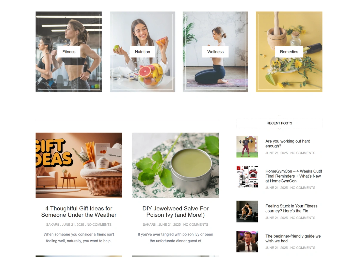
Four categories were fixed before anything else: Fitness, Nutrition, Wellness and Remedies. They sit in the header, again as image tiles under the hero, and again in the footer. That repetition is doing structural work rather than filling space. Health searches split into those four intents almost cleanly, and a site organised around them builds authority in each one instead of publishing scattered articles that never add up to a topic.
Content publishes automatically. Articles are sourced, rewritten and posted into the right category on a schedule, so the site keeps a daily rhythm without anyone opening the editor. The rewriting step is the part that decides whether this works, because duplicated health content does not rank at all in this category.
The layout was built around a running feed rather than a fixed page. A two-column article grid with pagination, a recent posts rail down the side holding eight entries, a You May Also Like row underneath, and a latest post block in the footer. Every one of those fills itself. Nothing needs curating, and the home page looks equally complete on a week with twelve new posts or with three.
The sidebar rail matters more here than on most sites. Health readers arrive from search for one specific question, get their answer, and leave. Eight related headlines sitting beside the article is the only thing pulling a one-question visitor into a second and third page, and session depth is what separates a wellness site that earns from one that just publishes.
The design leans calm rather than clinical. Soft green and orange, generous white space, photography of people rather than of products. Health sites tend to go one of two ways, medical and cold or aggressive and supplement-selling, and both make a reader defensive. This one reads closer to a magazine, which is the register people are actually comfortable reading health advice in.
Built to Publish Daily
Adding an article changes nothing. It lands in a category, fills the grid, appears in the rail, and rolls into the related row on its own.
The owner’s work moved from writing to steering, which is choosing what the pipeline covers and what it leaves alone. In a category this sensitive, that second decision is the more important one.